

It's all about the feels!
Headkandy are an award-winning team of hair extension technicians, with their Stockton branch the latest part of a growing empire.
Vision:
Our client gave us a free reign to work our magic and turn Headkandy’s latest salon in the old Milehouse pub in Stockton into the best salon in the region. Our only brief was to create an interior which would enhance the experience of visitors and inspire Headkandy’s stylists and beauticians. We were aware that as much as the space needed to look and feel great, it also needed to be practical and cater for the correct number of hair stations and backwashes.
Delivery:
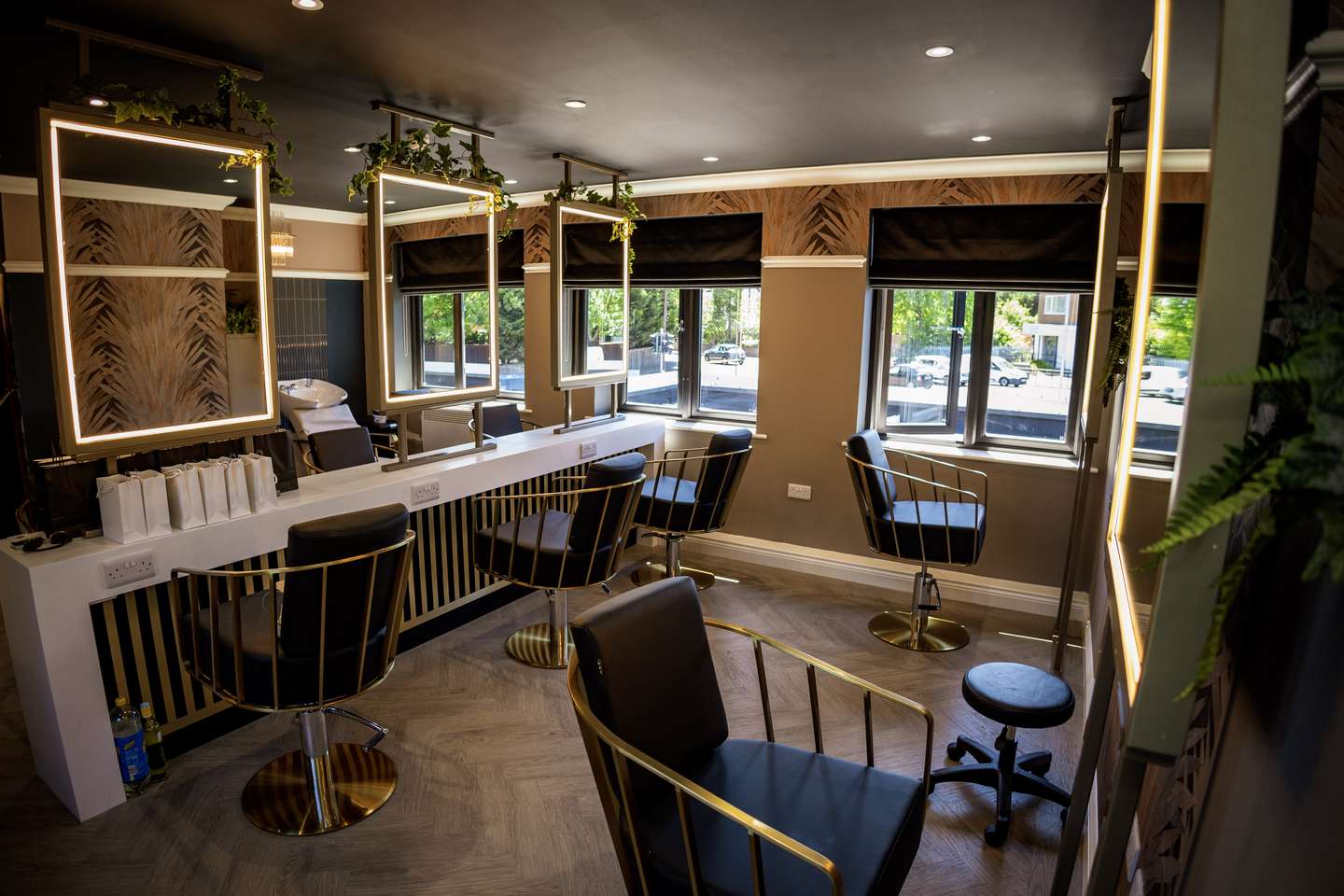
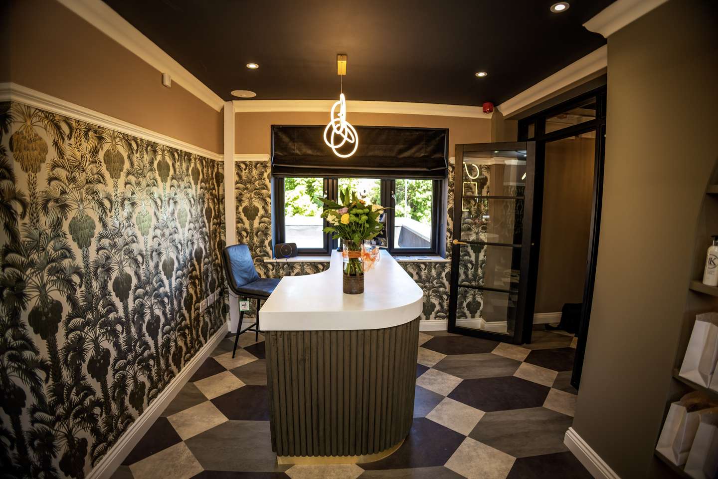
This project started with spatial planning and the creation of a practical layout for eight hair stations. We then incorporated extras which weren’t essential but would add to the whole customer experience. We considered what the client already had at their other sites and adapted the design to complement the new salon. With the building itself being restored from an old pub, we wanted to incorporate some traditional features with a modern twist, such as coving and picture rails. Dividing walls allowed us to mix up the wall finishes, contrasting bold wallpapers and block paint colours. Different levels of lighting and the use of geometrical shapes enabled us to create features throughout the design. Brass features throughout the furniture gave the design as a whole a modern touch.
Brand New Salon
This followed by adding meat to the bones and incorporating the extras, which weren’t essential but would add to the whole customer experience. We considered what the client already had at their other sites and wanted to adapt the design to coincide with this brand-new salon.
A Modern Touch
The design itself blossomed from the clients brief, which was to be the best salon in the area, giving us pretty much free reign. With the building itself being restored from an old pub, we wanted to incorporate some traditional features with a modern twist, such as coving and picture rails. Dividing walls allowed us to mix up the wall finishes, contrasting bold wallpapers and block paint colours. Different levels of lighting and the use of geometrical shapes enabled us to create features throughout the design. Brass features throughout the furniture gave the design as a whole a modern touch.

