

A 3D brand
The former Barclay’s bank building needed a renovation. One which gave the property an identity to match it’s adjacent and successful big brother; 16-Twenty Six.
Vision:
Adding detail to a property which lacked any was the first step. Distinguishing this building through its interior decor from its neighbour was the second. Whilst the other building was simple but smart in its design, we wanted the design for Twenty Eight-32 to feel more upmarket – attractive a different type of clientele and business.
Delivery:
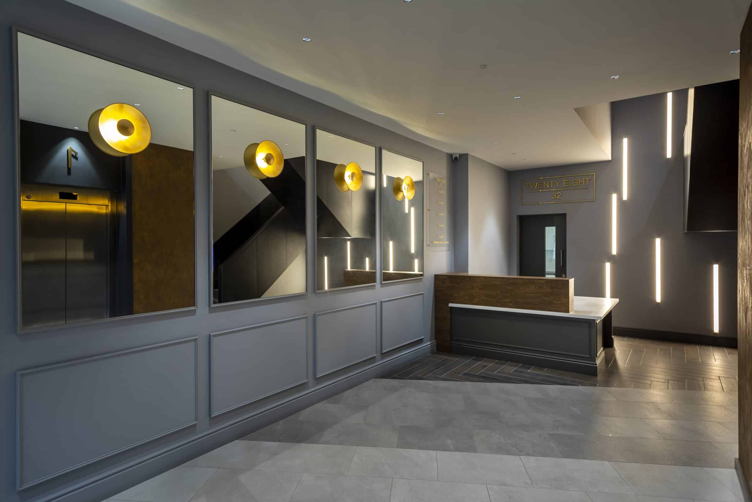
We created a monotonal colour scheme which concentrated on changes in finish and texture to help enhance the space.
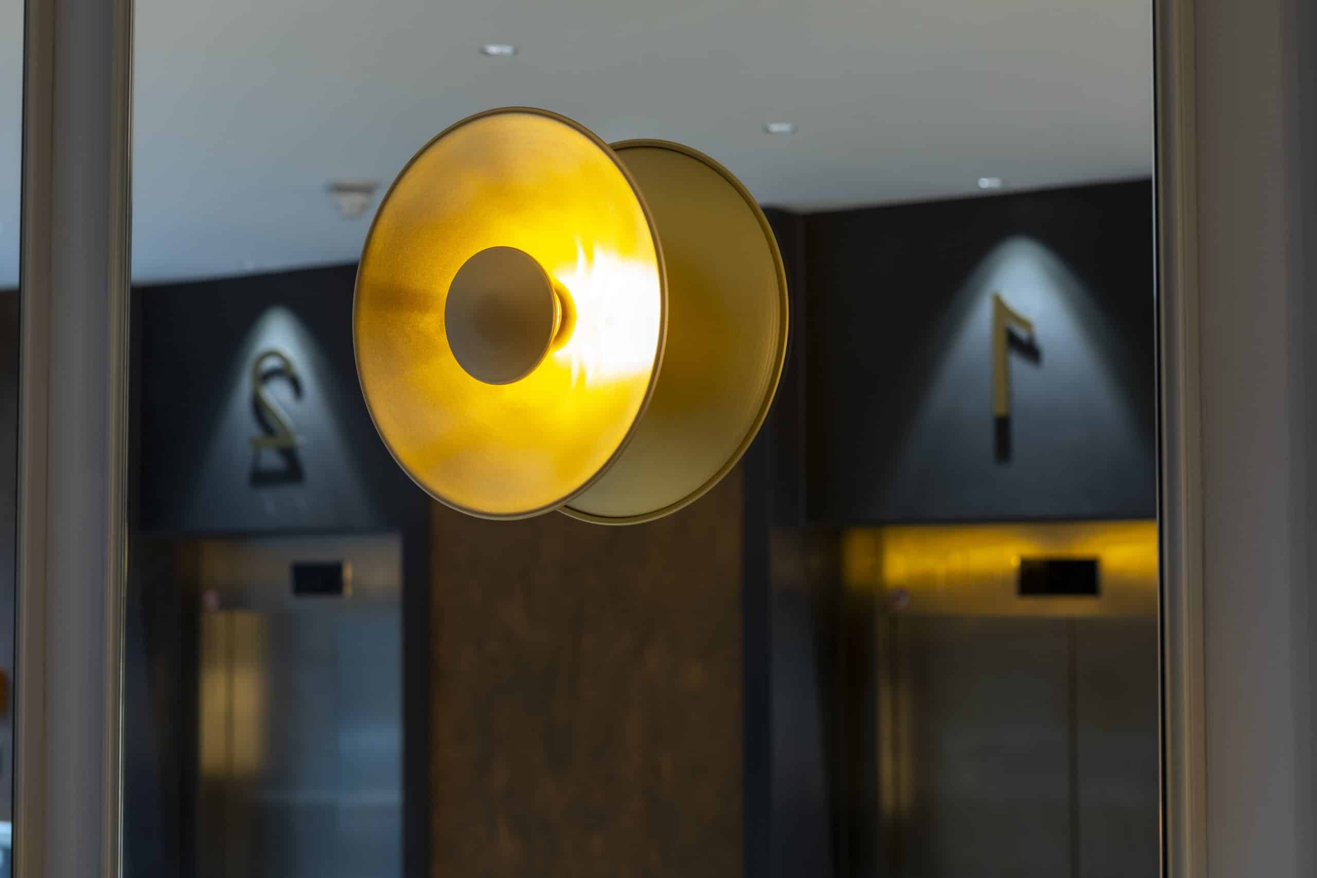
Panelling, with mirrors and wall lights above lead you into the space, whilst on the opposite walls, the lift is surrounded by a venetian plaster in a rust finish. We continued this through all floor levels.
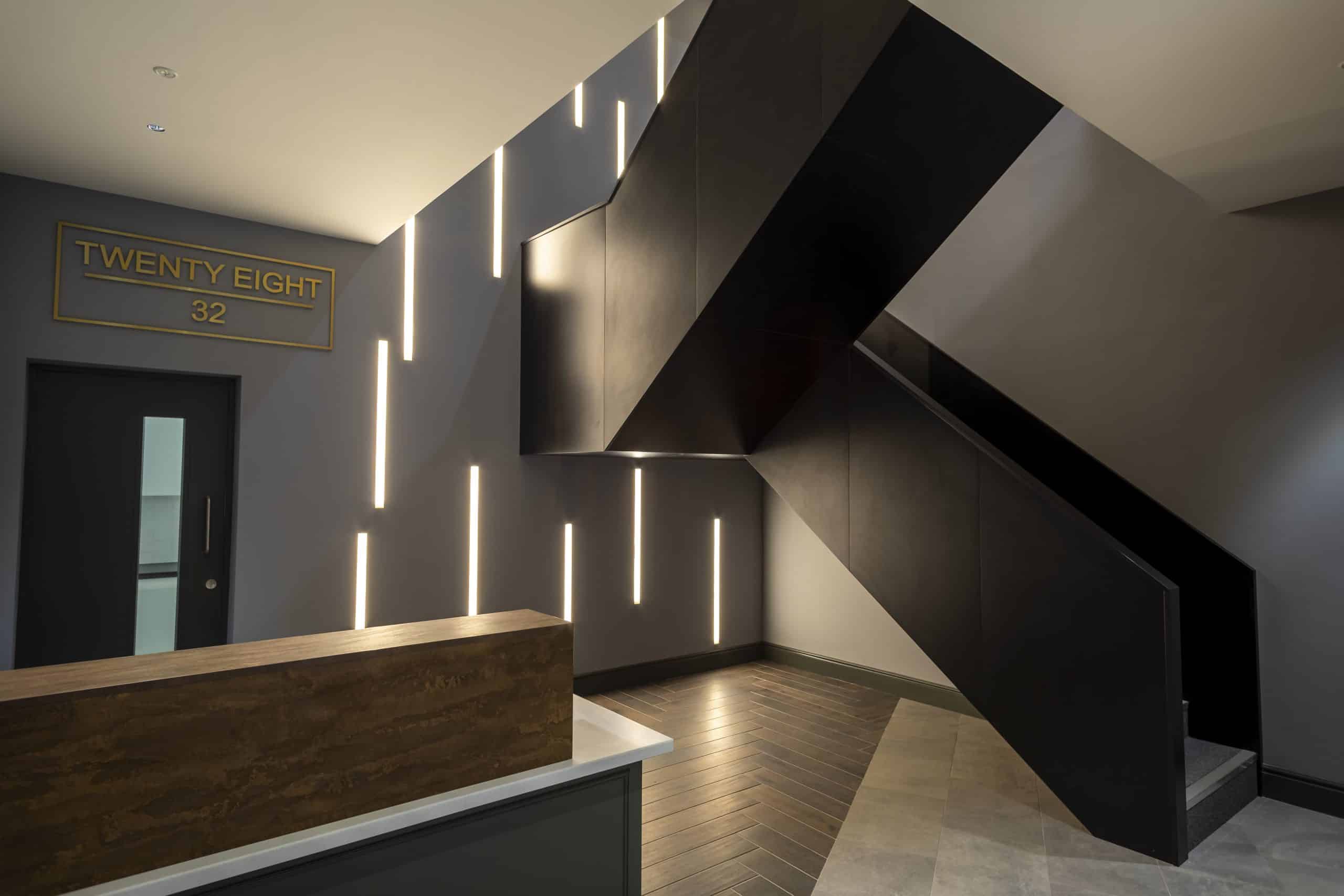
The feature LED lighting to the back wall fills the fill stairwell and has meaning; it is binary for 28 and 32.

